NASA Internship Merch Designs
Summer 2020
During my internships at NASA Goddard, I conceptualized and designed the official summer intern t-shirt. I also created a design for the NASA Pathways Program patch, inspired by the solar eclipse, the iconic NASA logo, and symbols of innovation, such as a lightbulb, representing bright ideas and the future of NASA. This project allowed me to blend creative design with NASA’s storied legacy, aiming to create visuals that inspire interns and celebrate their journey with NASA.
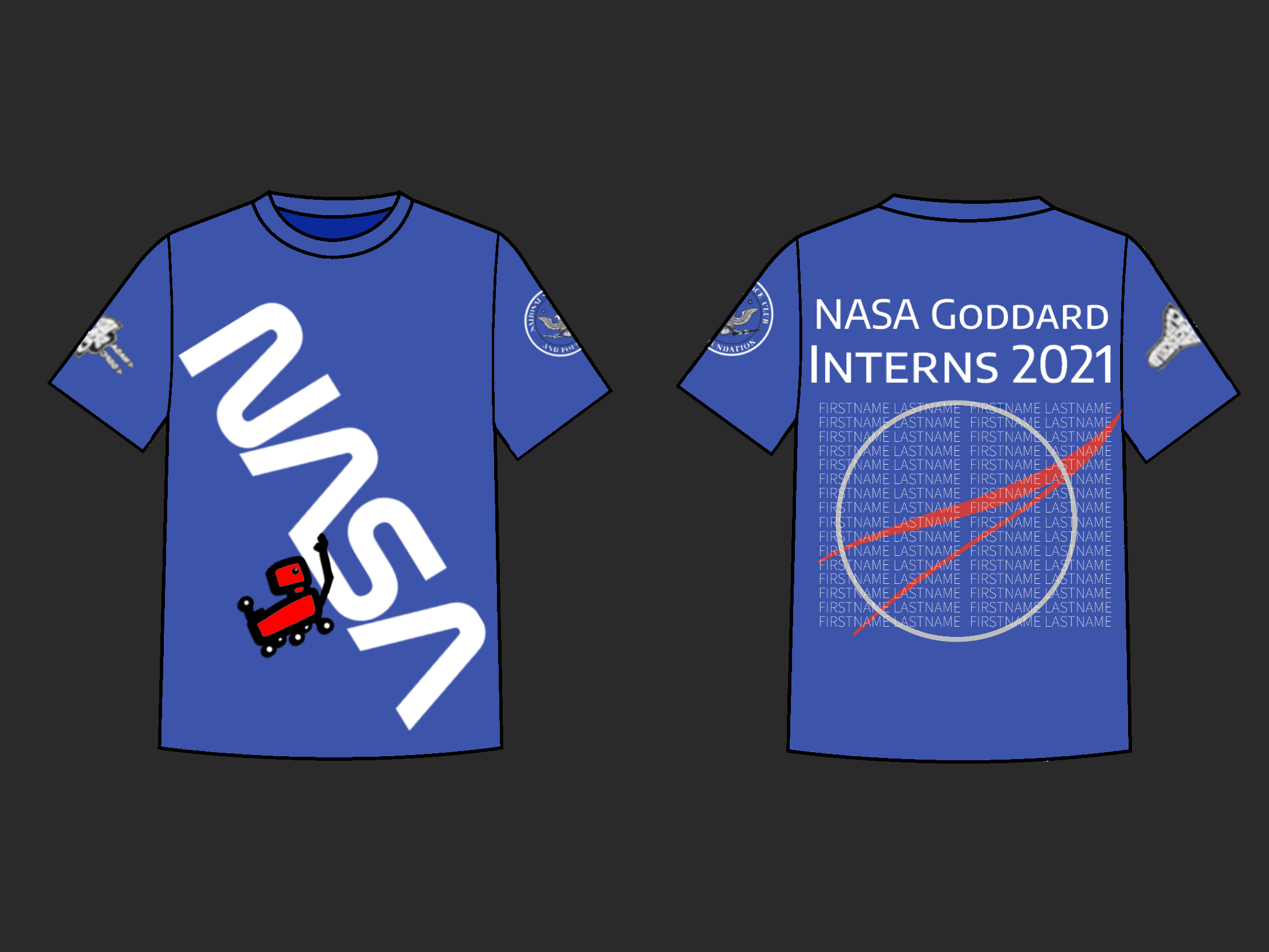
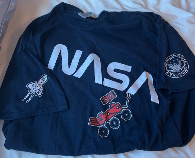
Summer Intern T-Shirt Design
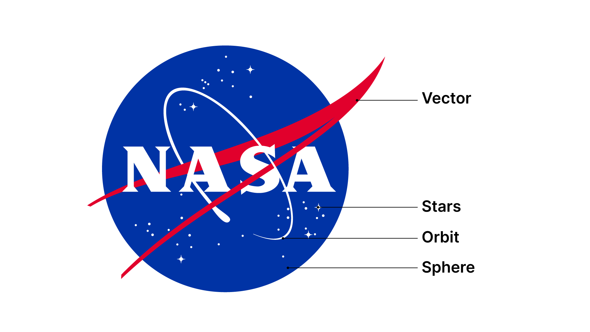
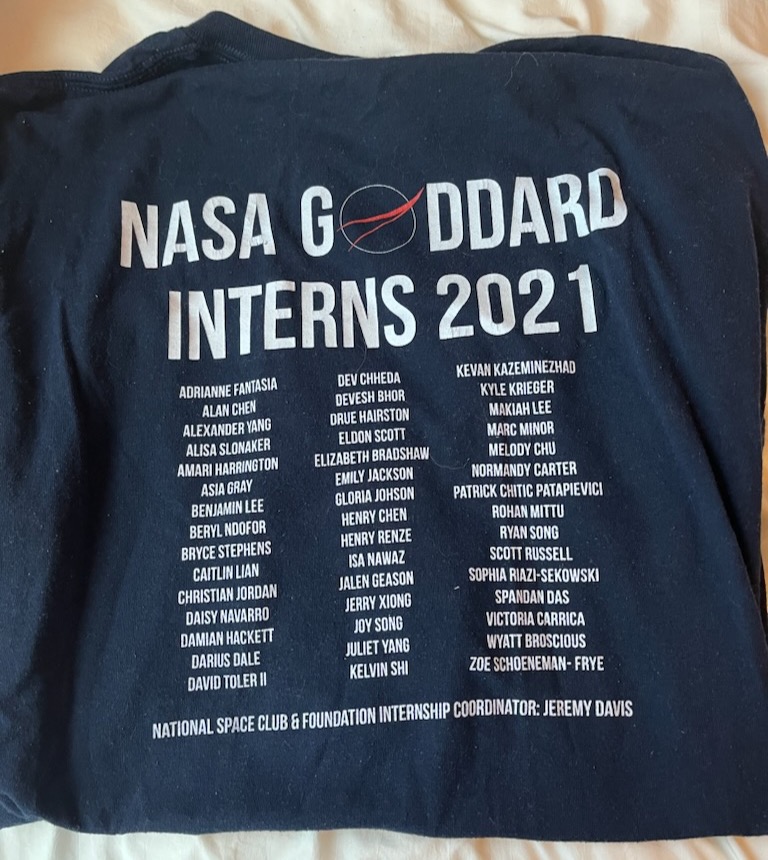
I designed the official t-shirt concept for the NASA Goddard 2021
summer interns, featuring the iconic NASA wordmark logo spanning
the entire front diagonal, to give the design some movement.
Hanging from the logo is a little red Mars rover, to bring some
fun and action, showcasing NASA's exploratory spirit.
Each sleeve features a patch representing the intern programs,
creating a sense of unity and pride among interns. On the back,
the classic NASA globe logo is filled with the names of all 2021
Goddard interns, along with a bold "NASA Goddard Interns 2021"
to celebrate their shared experience. With a color palette of
blue, white, and red to align with the NASA logo, the design is
intended to capture the pride and fun of
being a NASA intern.
Although the final implementation wasn’t
exactly as I envisioned (some adjustments were made by the department,
including a flatter angle for the wordmark and having the rover's arm
at a non-extended angle), it was still very cool to have my design and
concept chosen for the official shirt.
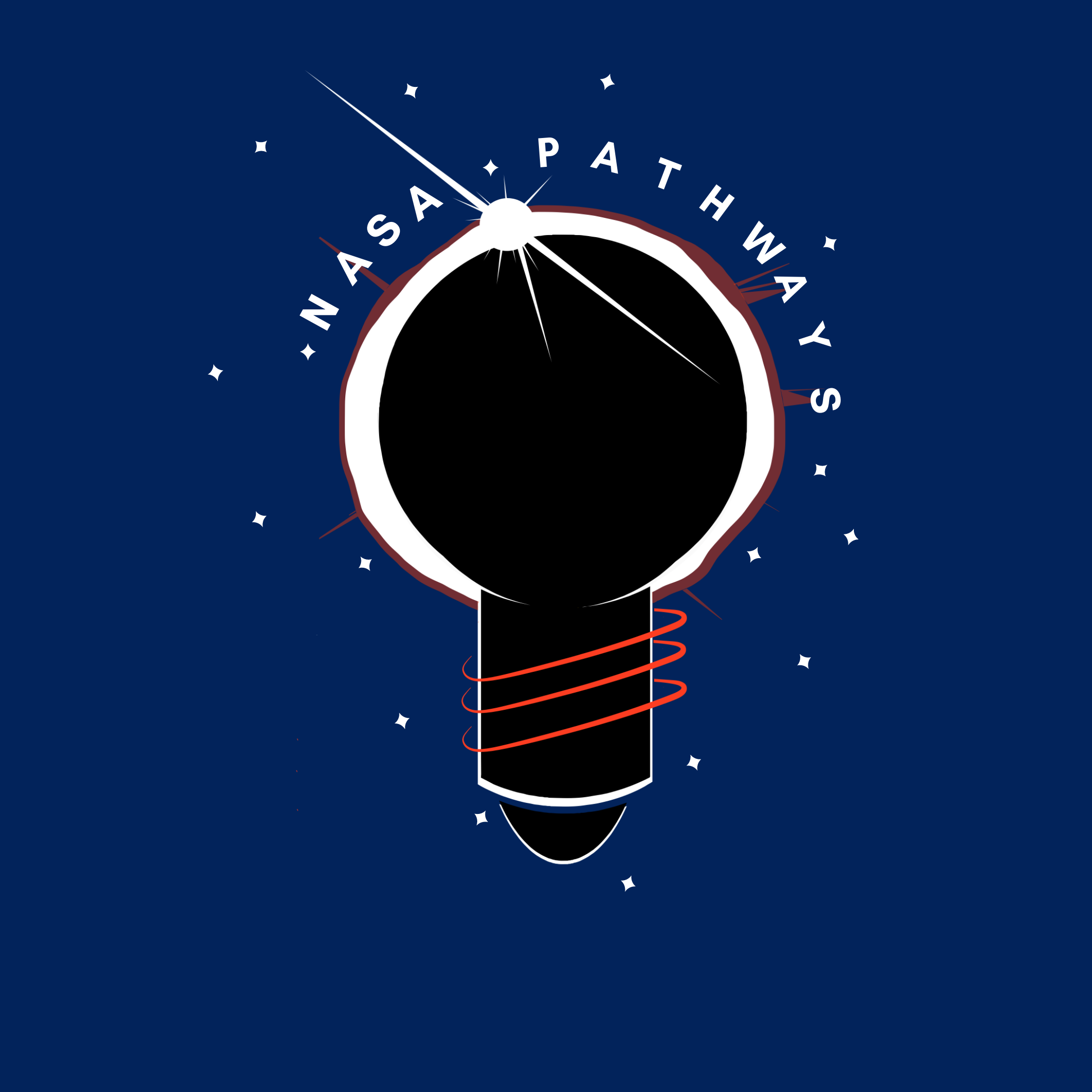
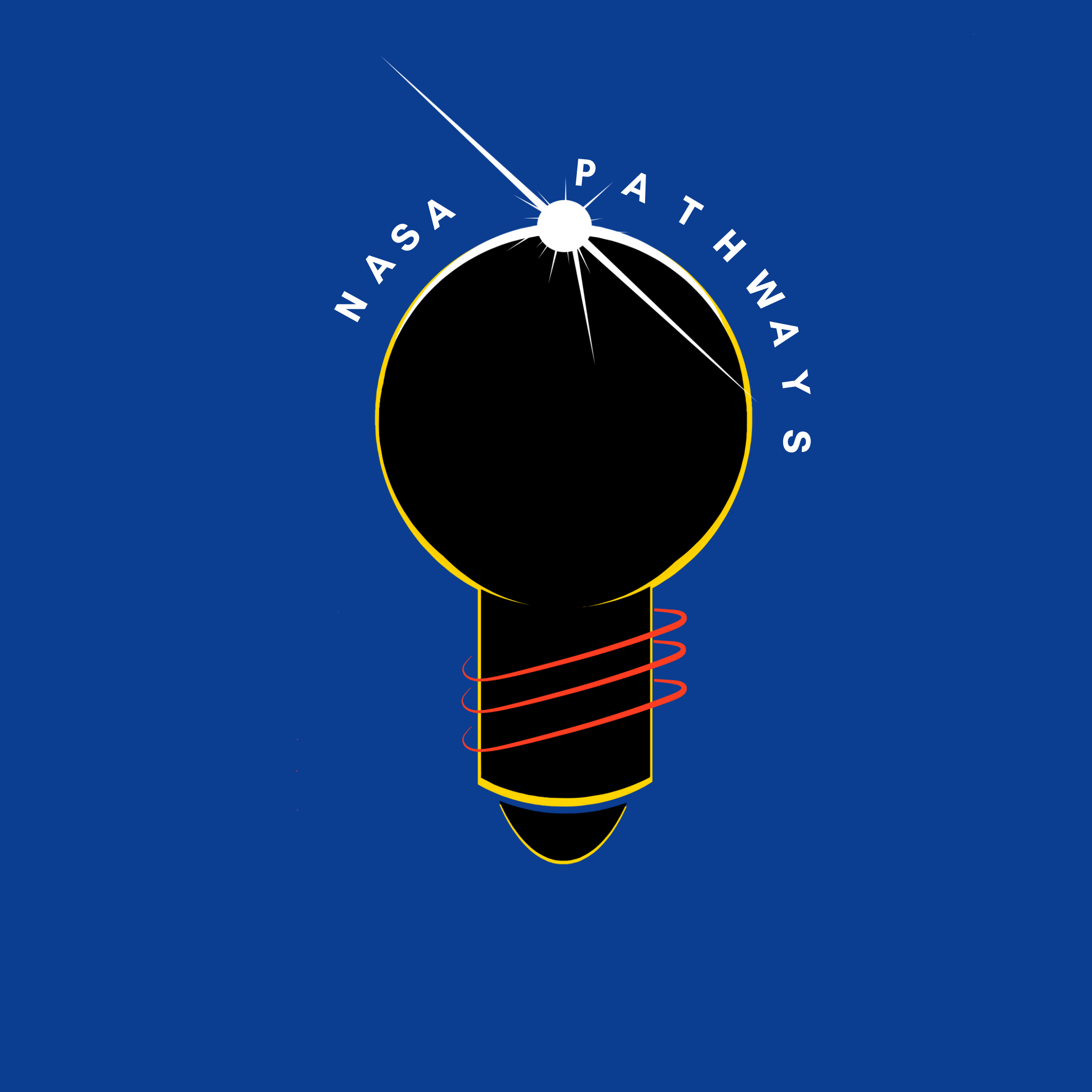
NASA Pathways Patch
For my NASA Pathways patch concept, I developed two unique designs
that celebrate the spirit of discovery and innovation within
the NASA Pathways program. NASA Pathways provides internships
and career development opportunities, allowing students and
recent graduates to gain hands-on experience while contributing
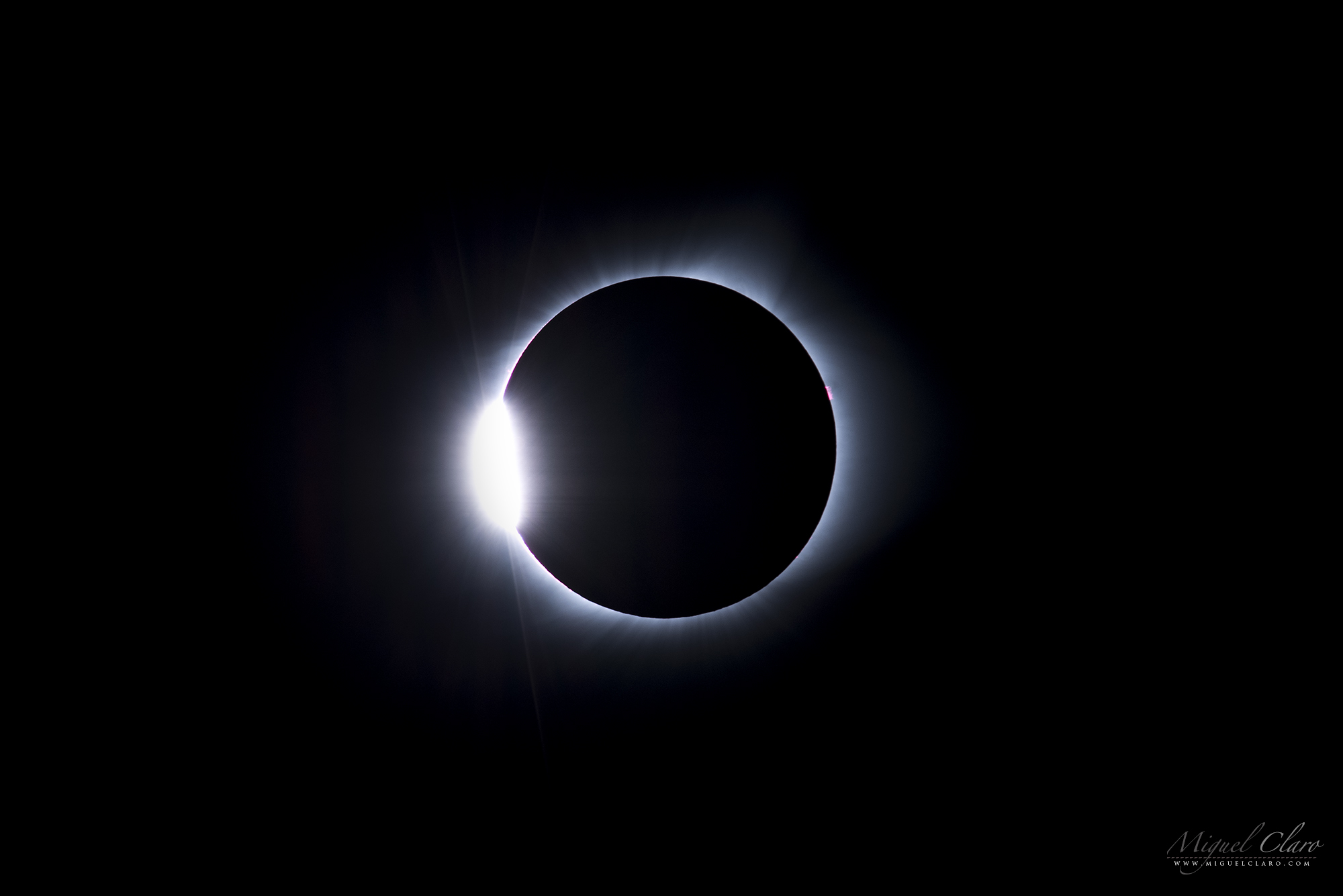
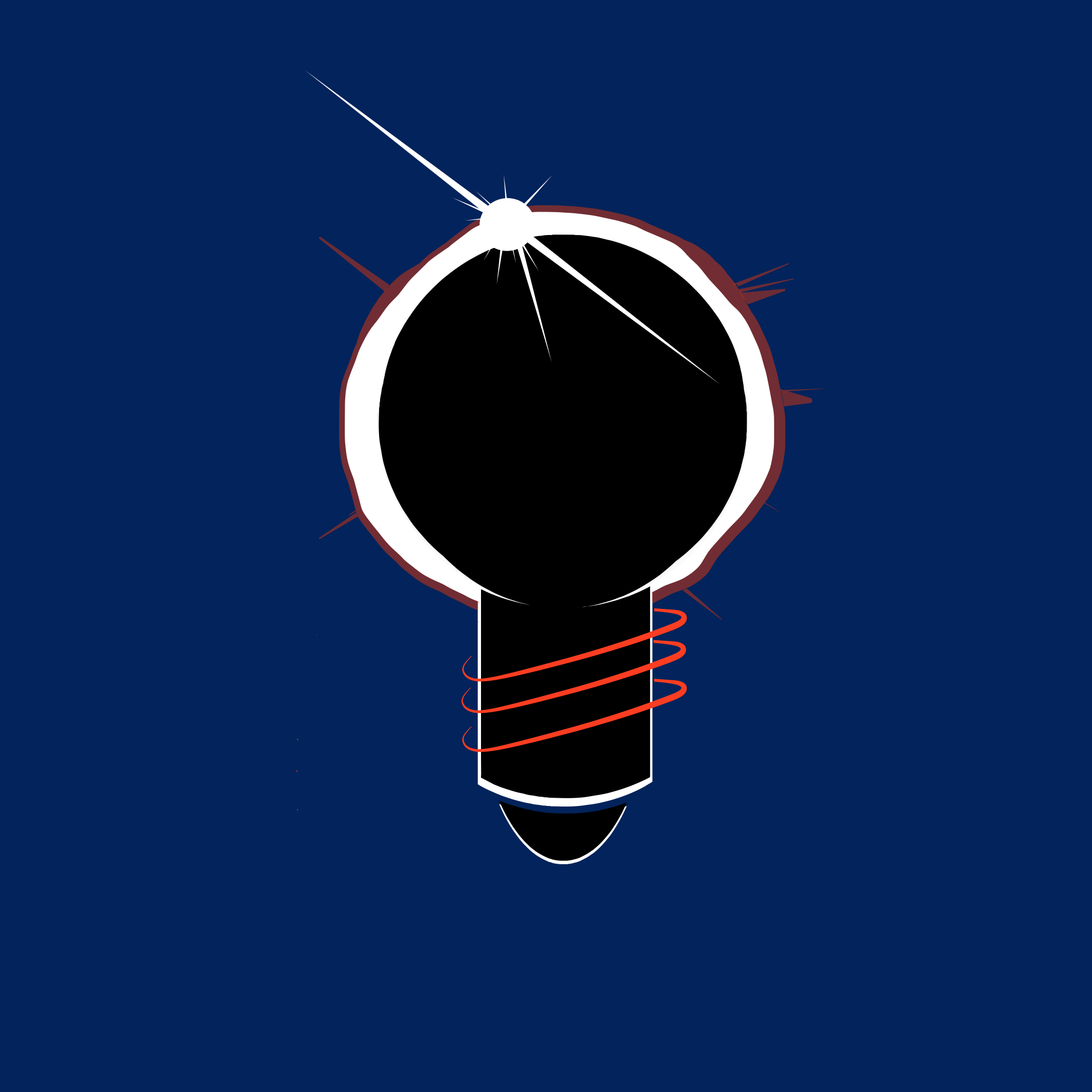
to NASA’s missions. Inspired by the solar eclipse at the
diamond ring stage—when a brilliant light is just about to
break through—I centered each design around a lightbulb,
symbolizing ideas and innovation on the brink of realization. The bulb also resembles that stage in the solar eclipse.
The lightbulb is wrapped with NASA’s iconic red ring from the globe logo,
integrating the NASA brand with this moment of emerging light and knowledge.
Illustrated on my iPad, I used solid colors (avoiding gradients) to ensure
the designs could translate well to patch form. The palette—red, white,
blue, and black—matches NASA’s branding, with the lightbulb set against
a deep space-blue background to represent exploration. Although these
designs weren’t selected, I’m proud of how they capture the journey of
learning and discovery within NASA Pathways, celebrating the program’s
role in shaping the next generation of NASA professionals.