Murakami Flowers Design System
October - December 2022
In my Communication Design Fundamentals class, I developed a visual design system for the new Murakami.Flowers NFT collection, created from Takashi Murakami's iconic flower motif. The end result was a design system, magazine spread, and an Instagram ad.
Results Preview:
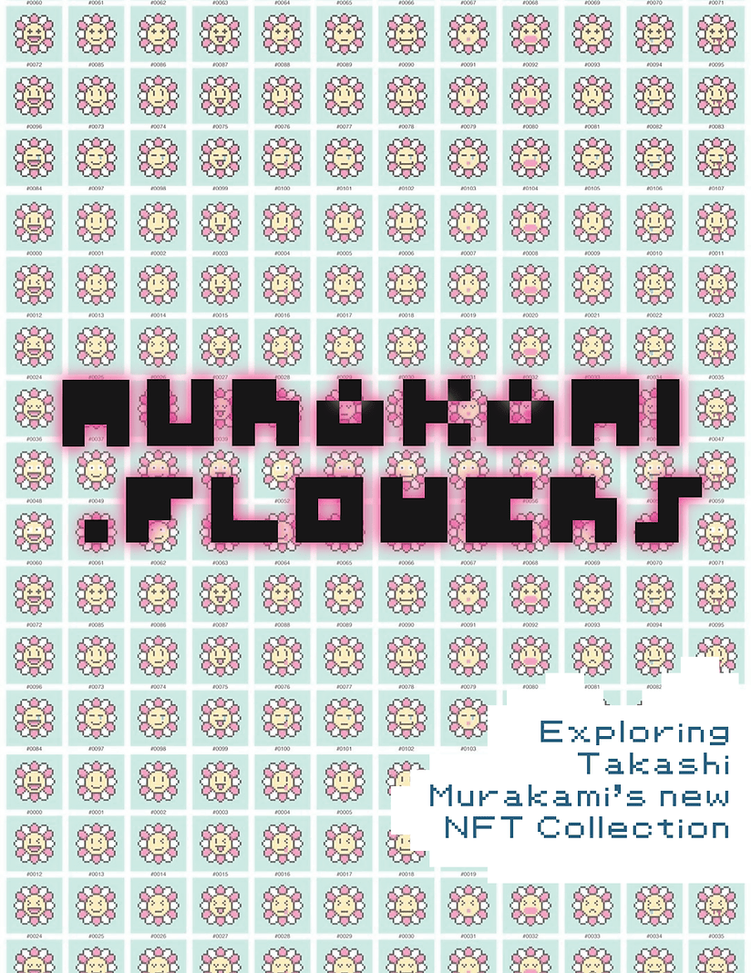

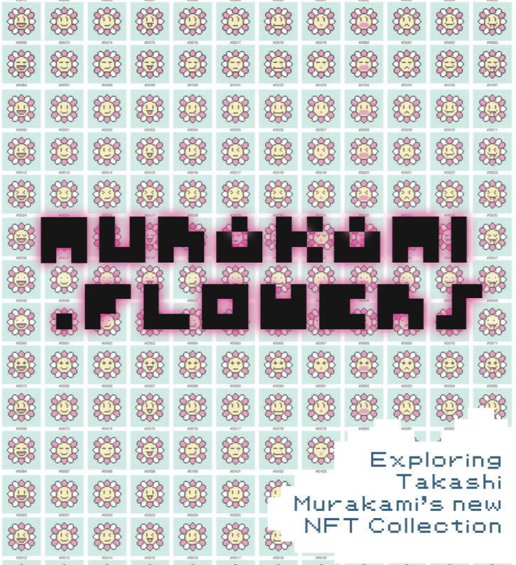
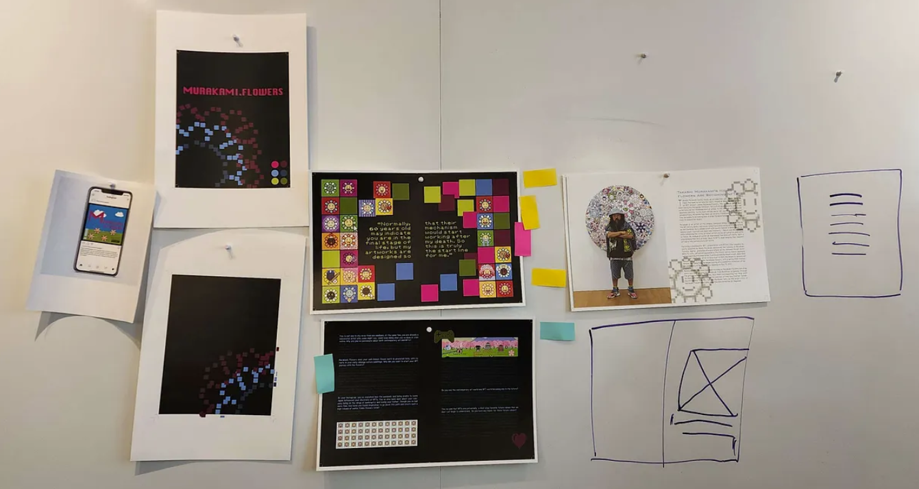
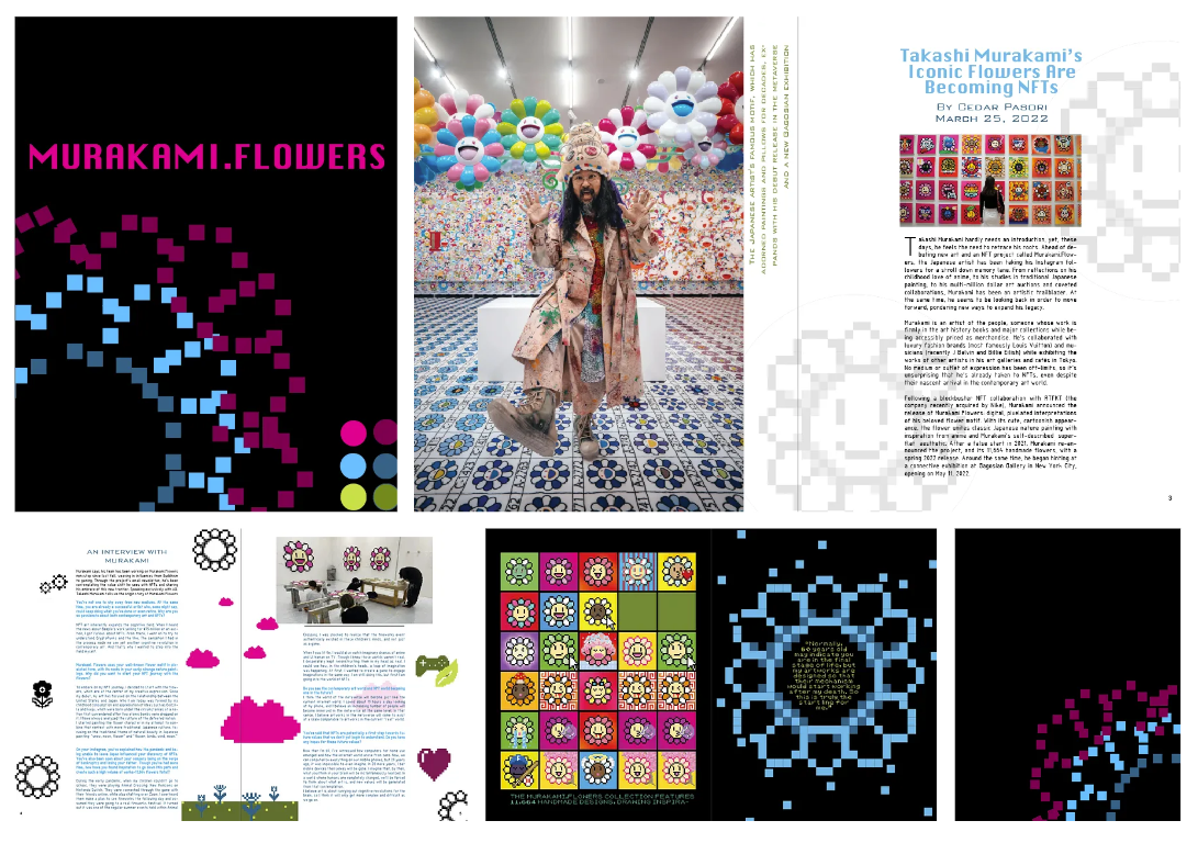
Final Magazine Spread
About The Assignment
Assignment: Design a cohesive design system, mood board, magazine spread, and Instagram ad for a social/cultural story.
Project Goals
- Practice communicating ideas across physical and digital mediums.
- Create and convey a cohesive visual style and theme.
- Practice design concepts such as hierarchy, emotional expression, typography, Gestalt principles, and color.
- Deepen understanding of creative software tools, such as Adobe Illustrator, Photoshop, and InDesign.
Ideation Phase - Exploring Feature Content and Inspiration
Feature Content
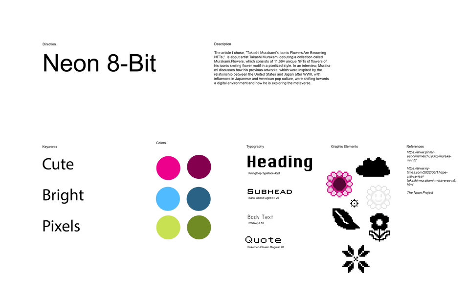
The article I chose, "Takashi Murakami’s Iconic Flowers Are Becoming NFTs", is about Japanese contemporary artist Takashi Murakami debuting an NFT collection called Murakami.Flowers, which consists of 11,664 unique flower designs, featuring his iconic smiling flower motif in a pixelized style. In an interview, he discusses his new exploration of digital mediums and how art interacts with the metaverse.
https://www.architecturaldigest.com/story/takashi-murakami-flower-nfts-interview
After reading the article and analyzing the images, I wanted to highlight the boldness and cuteness of his art style and draw upon the idea of “digitization” with inspiration from 8-bit retro games and pixel art. Murakami's previous works, especially those with flower motifs, often show a street art/pop art influence, with a bright, cute, psychedelic, and subversive look.
Potential Key Words: bright, digital, lively, pop culture, superflat art, kawaii
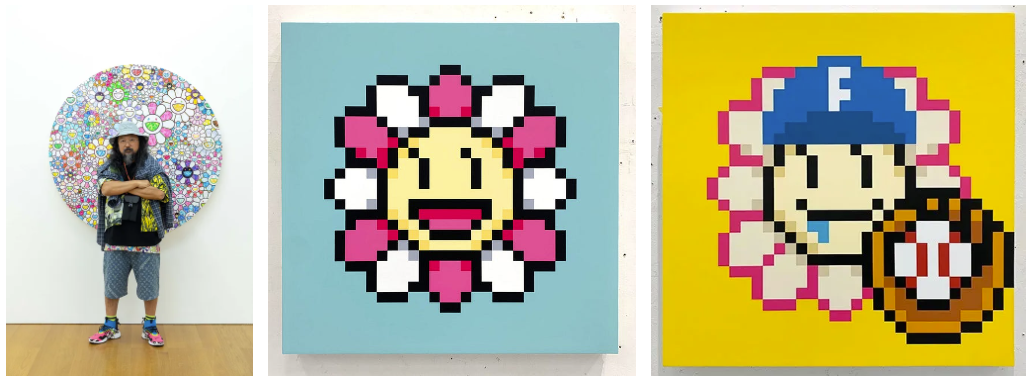
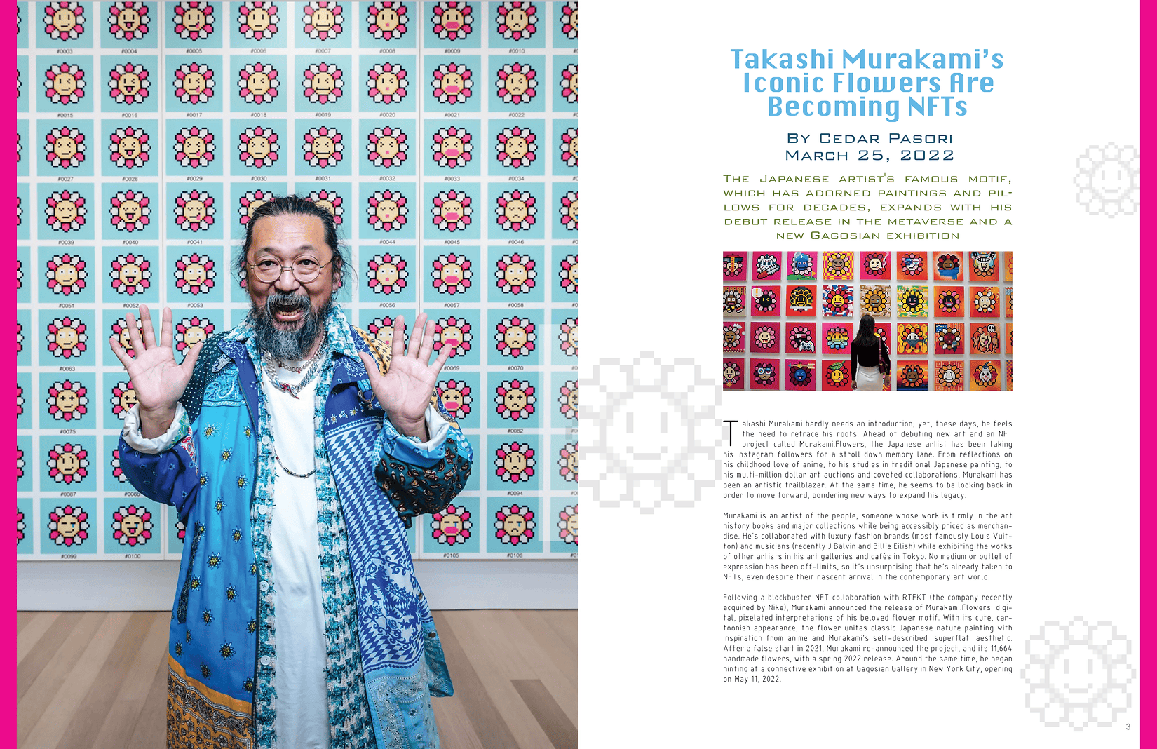
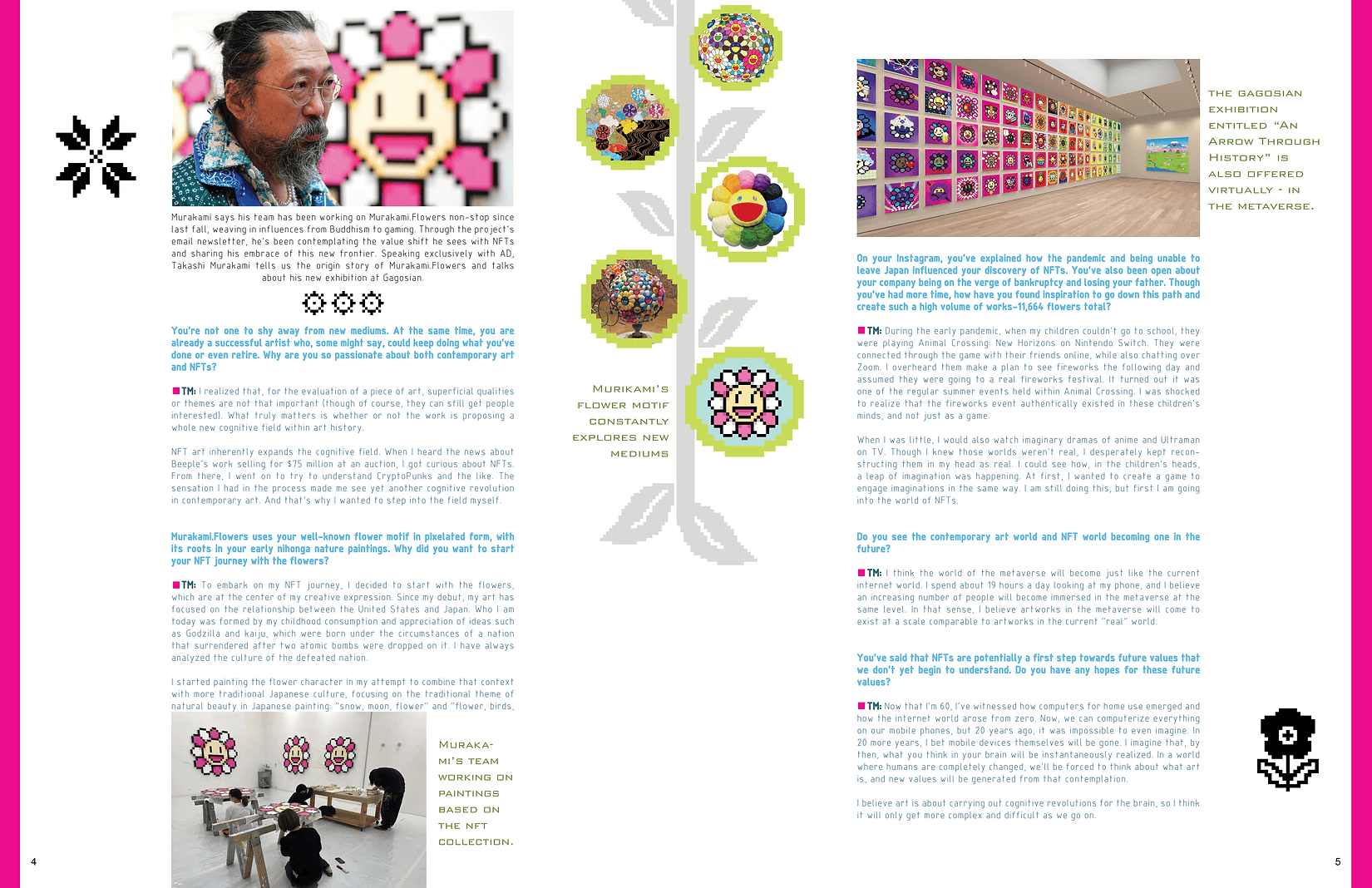
Images from the article: Takashi Murakami standing in front of one of his more iconic applications of the flower motif, and 2 examples of the pixelized flower NFT’s he released in this collection
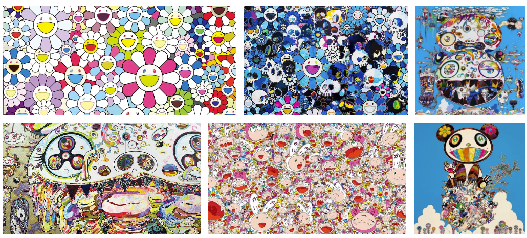
Looking at Murakami's previous work to get a better sense of his art style
Developing a Design System
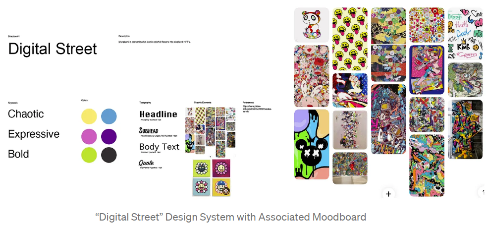
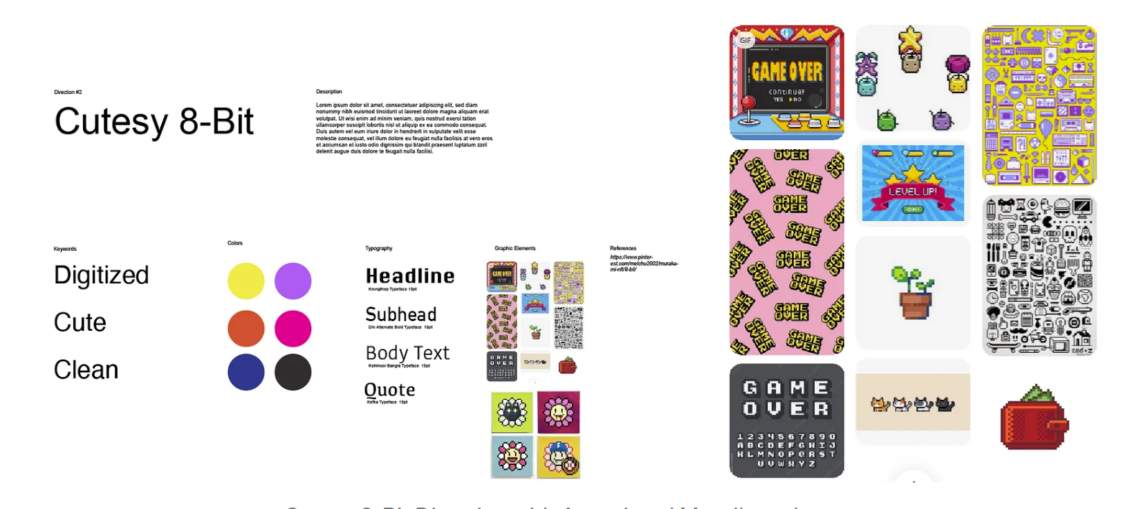
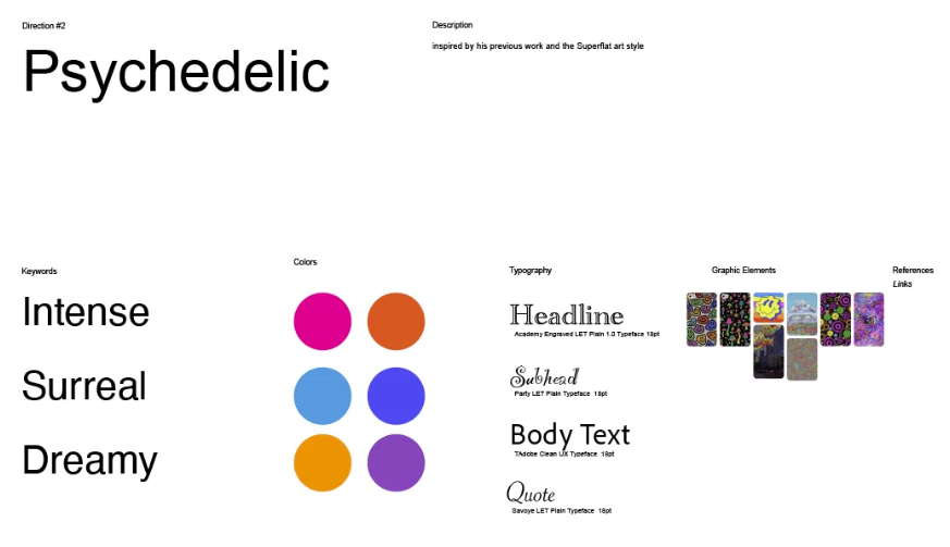
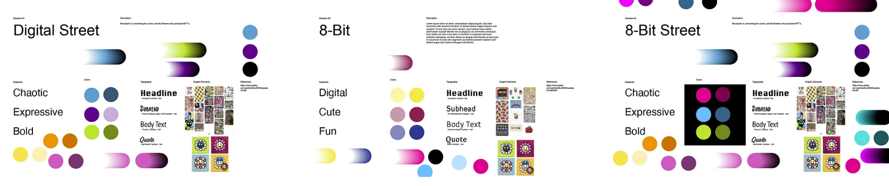
Initial Moodboards: Based on the research and inspiration collected into Pinterest moodboards, I explored 3 potential directions:
- Digital Street: Inspired by dark, bold streetwear/street art but with a cleaner, digitized feel.
- Cutesy 8-Bit: Inspired by 8-bit retro games and pixel art, with a bright, simplistic, and cute feel.
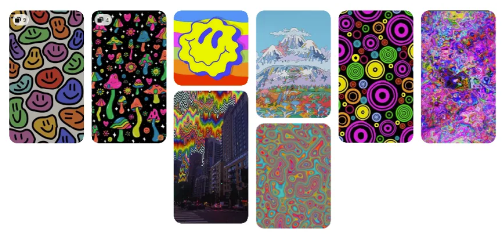
- Psychedelic: Draws upon dreamy, melty, and subversive works with lots of organic swirly lines.
Design System Iterations
I decided to combine the first 2 directions into “8-Bit Street” featuring bright, modern colors in a pixelized/retro video game aesthetic. The final color scheme used pink, blue, and green to evoke a bright, playful, cutesy vibe - reminiscent of flowers and nature, yet distinctly neon and digital. I also used more digital-looking fonts and included more pixel-art iconography.
Exploring color palette options
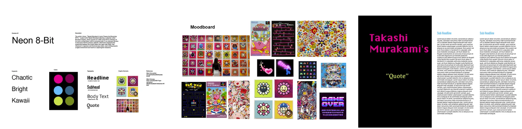
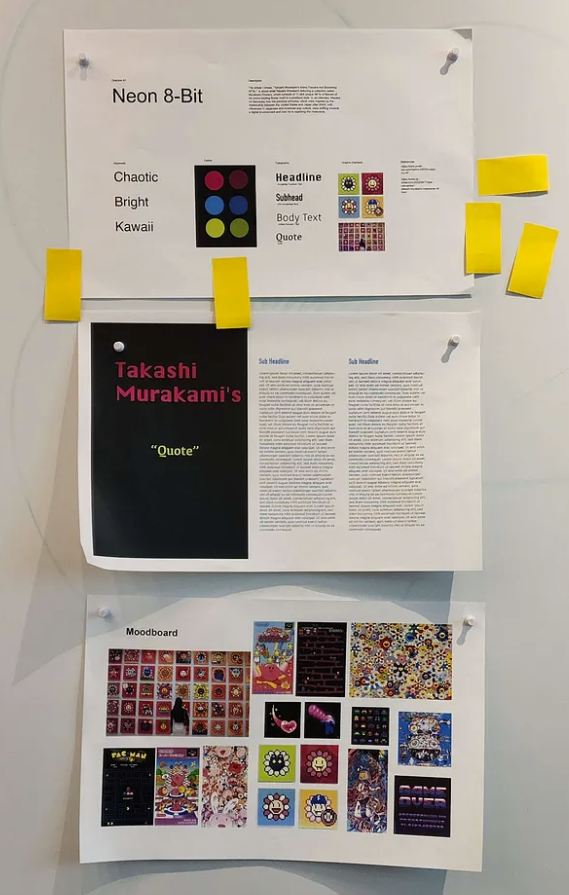
Updated Design System, Neon 8-Bit, with associated moodboard and sample magazine application
Design System Critique
My system had 5 votes from the class for a successful color scheme, and I received feedback that the header font and color palette did fit the theme and the subject successfully. I was also told to think more about what types of elements to include for graphics, since I currently only have a few photographs from the article, but maybe I could include icons for visual flourish, for instance, one suggestion was a graph, like how NFT value is often represented in graphs. I think moving forward I’d like to work more on finding better typefaces for the subheader, body text, and quote to better fit the digital style.
Creating the Instagram Ad
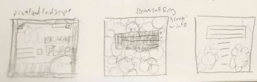
Instagram Ad Sketches
For these three thumbnail sketches, I had 3 main ideas. The first idea was to make it look like a screen from a cutesy 8-bit video game, with pixelized flowers and a little "landscape" with grass and sky. The second idea is based on Murakami's previous flower pieces, which often show a collage of overlapping flowers. In this idea, all of the flower's faces would be facing towards the main text, which has the actual ad information. The third was a simpler design with the text as the main focus, and two flowers embellishing it.
Instagram Ad First Digitization
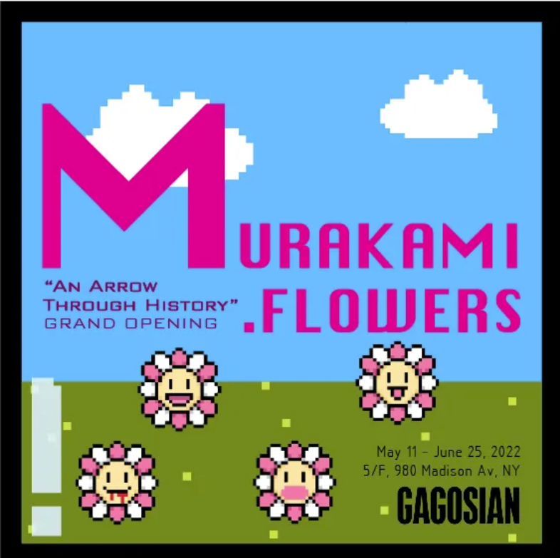
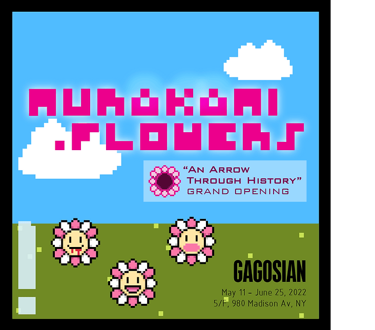
For the Instagram ad, I ended up going in the 1st sketch direction of a pixelized landscape background in a video game, because it would be too difficult to source/create different angles of the NFT's for the 2nd design, and I wasn't as excited about the 3rd design. I decided to make my ad promote the Gagosian Museum Exhibit, “An Arrow Through History”, mentioned in the article, which showcases a lot of the Murakami.Flowers collection. The ad's concept is a video game screen, with a pixelized highlight and a black border being a screen. I used the pinks, blues, and greens from my color palette and the same fonts from my design system
Making the Magazine
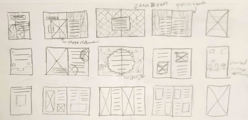
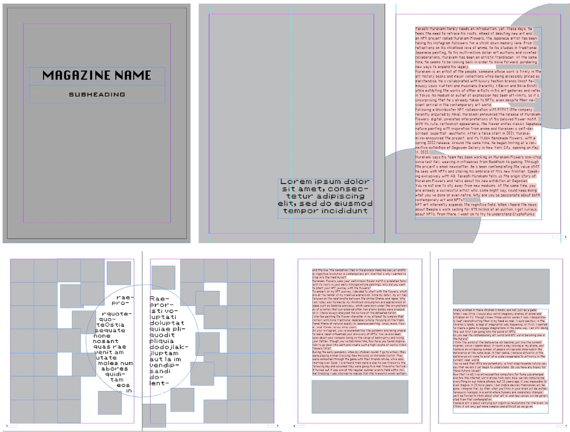
Initial Sketches (Grid System)
To start on the magazine, I sketched out 3 different layouts, each with different grid systems (modular, manuscript, 2-column) for breadth of exploration. With modular and manuscript, I had a clearer plan for them (e.g. the center spread could be a collage of the NFT’s with a pull quote in the middle). I also felt that there was more space to work within those grid systems: I could move visuals and text around with modular, and I could use the margins for visuals in manuscript. I also began finding visuals for the magazine, primarily sourcing icons from the Noun Project. I tried to find pixel art and digital-looking icons, since they're reminiscent of the collection's style.
Feedback: Agreed on using 1st 2 layouts (playful/dynamic but different from each other). Also received positive feedback on collages of the NFT’s to showcase variety of his work. Be careful of text in centerfold! Could be an issue with physical stapling and bounding. Think about how elements will interact with the physical fold in the center
 Initial Magazine Layout Sketches
Digitizing the Magazine Spreads
I then started digitizing the magazine grid layout sketches, implementing the chosen typefaces, and testing the placement of images. The initial digitization is kept in greyscale this week to focus more on placement.
Manuscript Grid System
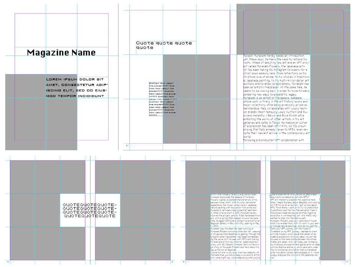
Modular Grid System
Once I had the general layouts digitalized, I started filling in captions, pull-quotes, and images.
Manuscript Grid System
Modular Grid System
Interim Critique 1: 3 votes for successful color, 2 for hierarchy, and 1 for typeface Make text smaller, make text pages white to improve readability Focus on the story/flow (e.g. process photos) Make interview spread more playful to match other spreads Will put more thought into placement of pages/elements, and better visuals.
Printed Spreads at Critique
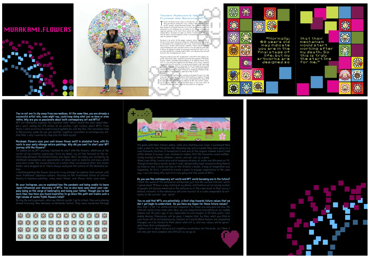
Continuing Magazine Iteration:
I made several changes in this iteration of the magazine to try to make the magazine more visually dynamic and include more photos/iconography.
- Switched out 1st Murakami intro photo to a more dynamic/excited one
- Made text smaller and increased margin size to make room for captions/iconography
- Made ghost flowers overlap the page seam to be less rigid
- Added author’s name and a photo of the Gagosian gallery (pg 3)
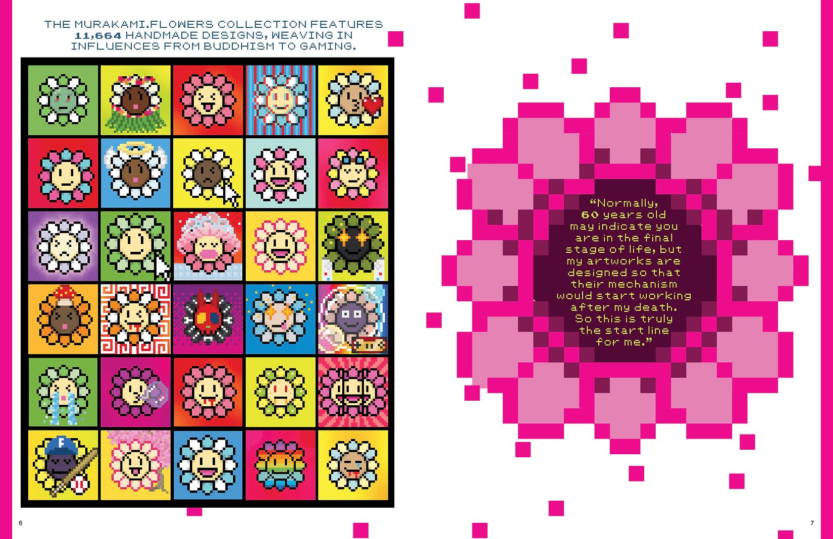
- I also added more pixelized iconography on pages 4–5, both sourced from the Noun Project, and original. For the original elements, I used Illustrator to trace out one of the flower outlines using squares in two shades. I tried to include more pixelized nature elements, like flowers and clouds, to tie in with the Instagram ad’s theme. I also changed the last spread to be one collage of the NFT’s, and one pull-quote with the pixelized flower kind of deteriorating at the edges. I feel like this iteration was much more dynamic and was trying to convey the pixelized theme more.
Printed Spreads at Critique
Continued Magazine Iteration
Original pixelized flower icon made by tracing the NFT outlines in Illustrator
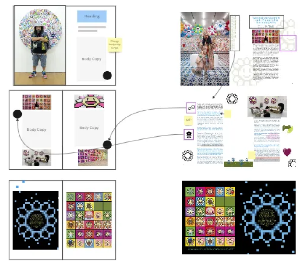
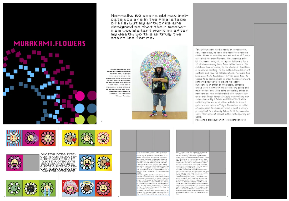
Miro Feedback on New Iteration
This iteration was also put in Miro for more detailed annotated feedback. In general, the instructor liked that the photography is more narrative, but some placements/styling are making the spreads unbalanced or harder to engage with (e.g. readability of vertical caption - pg 2, ghost flowers too big - pg. 3). Pages 4–5 also look a bit awkward/cluttered, which she agrees with, and she suggested simplifying the layout of the visuals, by including less iconography and using them just as accents, and placing the images in line with the text to look neater. She also suggested making the final spread, pages 6–7 white to match the rest of the inside pages.
Magazine Iterations and Feedback
Feedback emphasized the need for better visual balance and readability. Adjustments were made to the magazine spreads to enhance visual dynamics, include more iconography, and refine text placement and size for improved engagement.
Final Results
The final outcomes include a vibrant design system, an Instagram ad with a pixelized game aesthetic, and
a dynamic magazine spread that effectively communicates the playful and modern style of
Murakami.Flowers.
Final Magazine Spread
Final Design System
Final Instagram Ad