Futura: Type Specimen Poster
October 2022
For my Communication Design Fundamentals class, we were assigned a popular typeface to research. Using typography and design principles, we designed a Type Specimen Poster for that typeface. My assigned typeface was Futura.
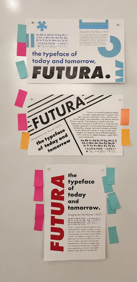
Ideation Phase - Poster Layout Sketches
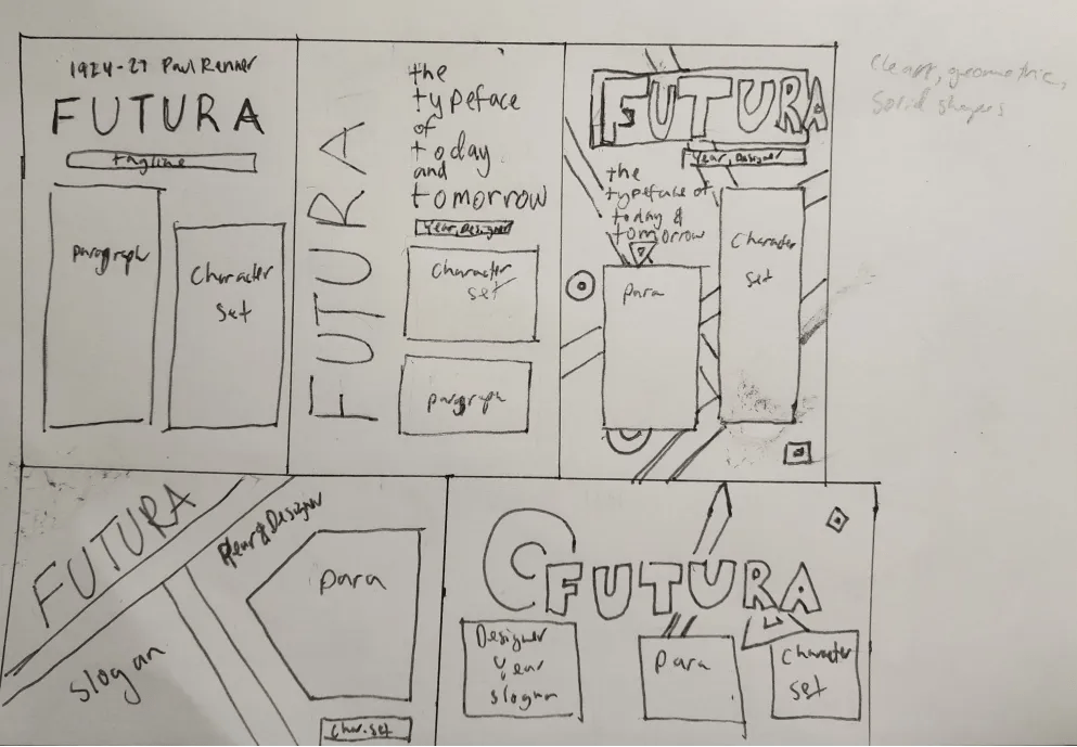
Based on my background research and general impression of Futura, it seems like a clean sans-serif font that simplifies shapes into their base geometric shapes. This, along with what we learned in class, is why I wanted to make my poster as legible and organized as possible, incorporating clean lines and basic geometries. For initial layout sketching however, I wanted to just focus on element placement. I also made sure to include both horizontal and vertical layouts to explore a variety of options.
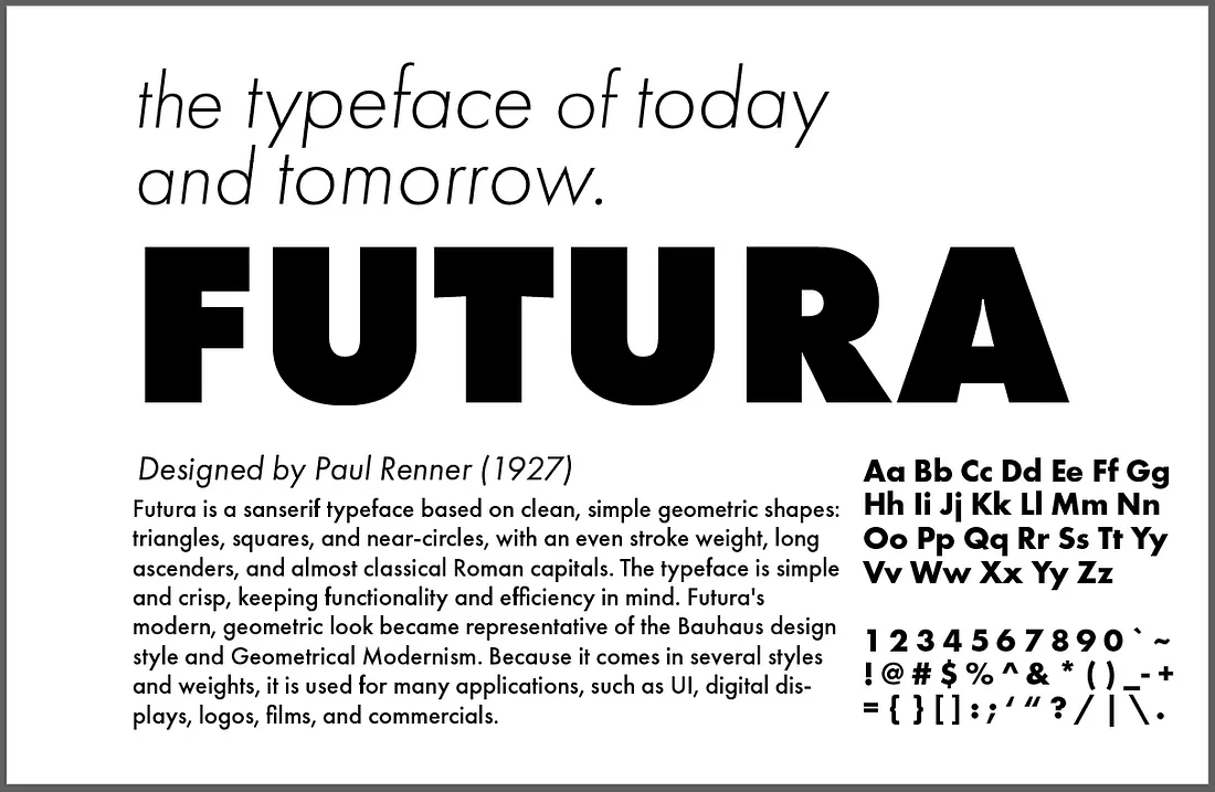
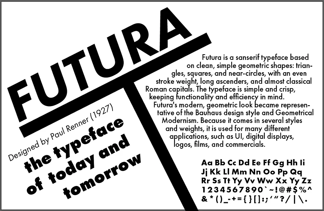
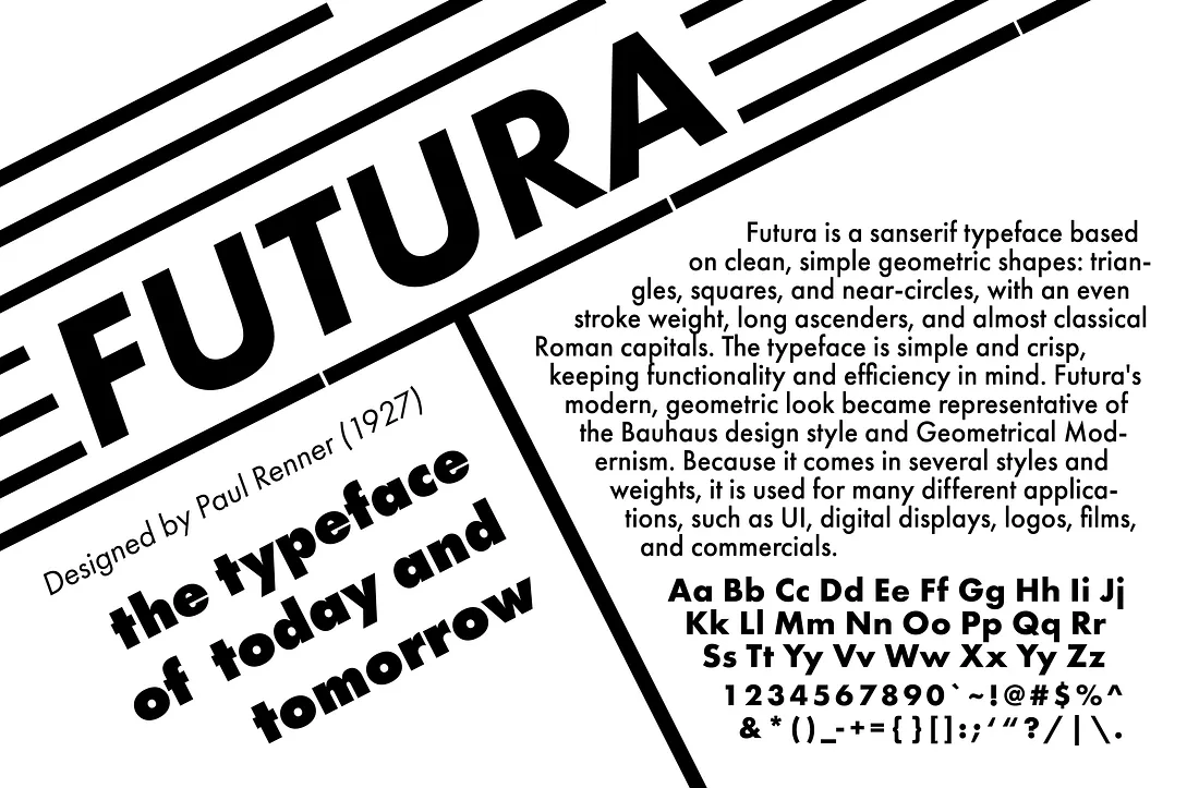
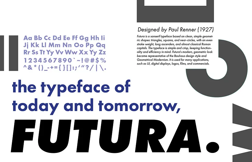
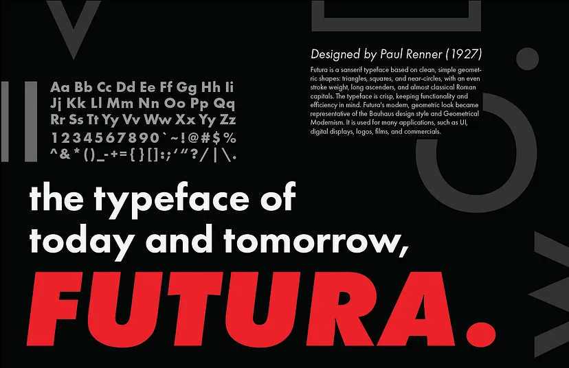
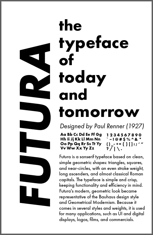
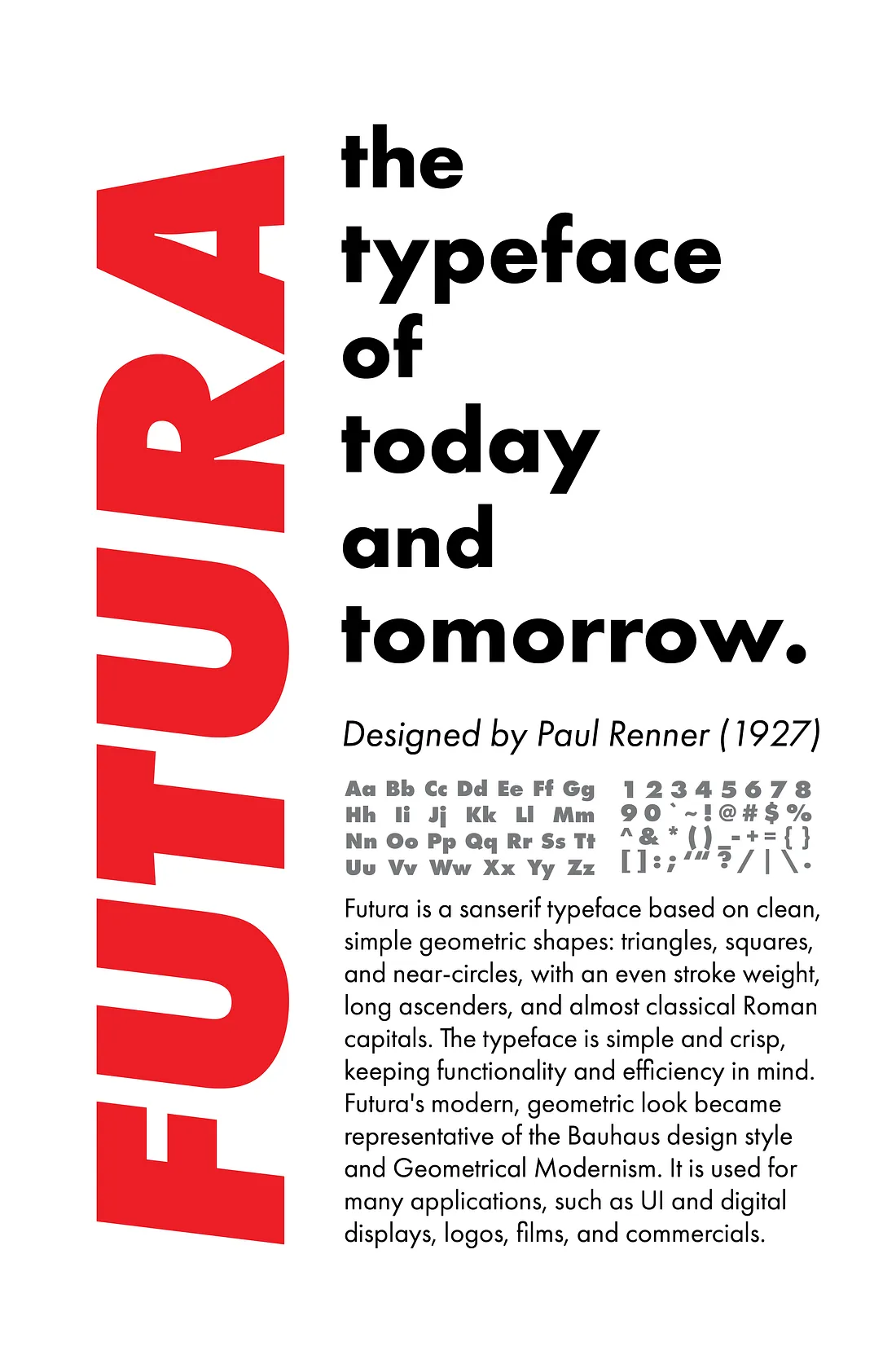
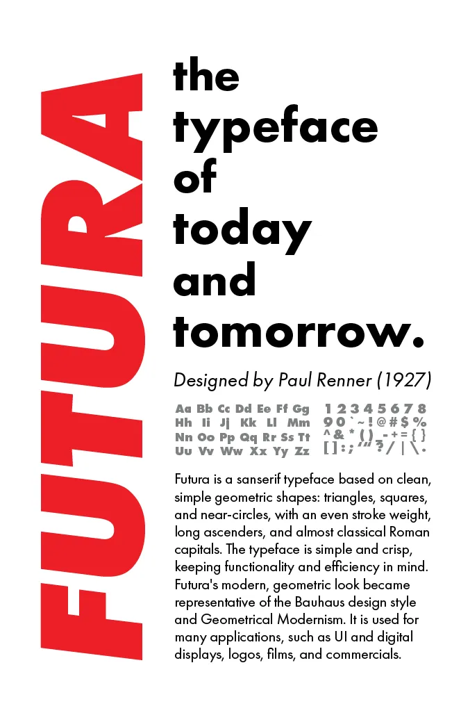
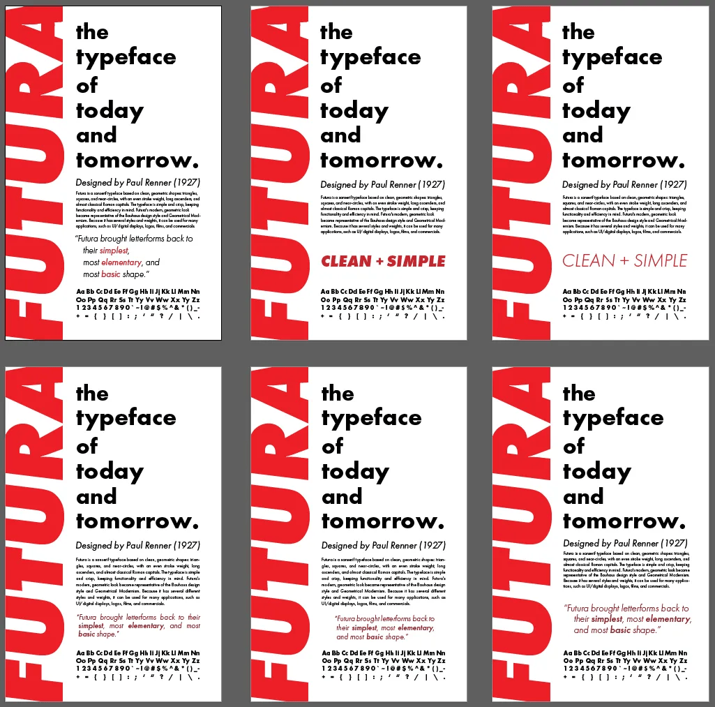
Digital Iterations
Throughout the digital iteration process, I spent a lot of time coming up with and creating several iterations of different designs. I also tried to utilize negative space more effectively and clean up the shapes that the texts make on the page.
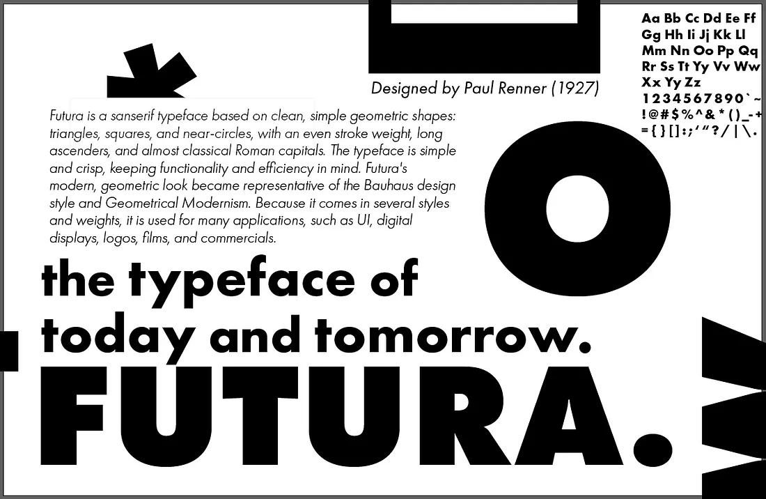
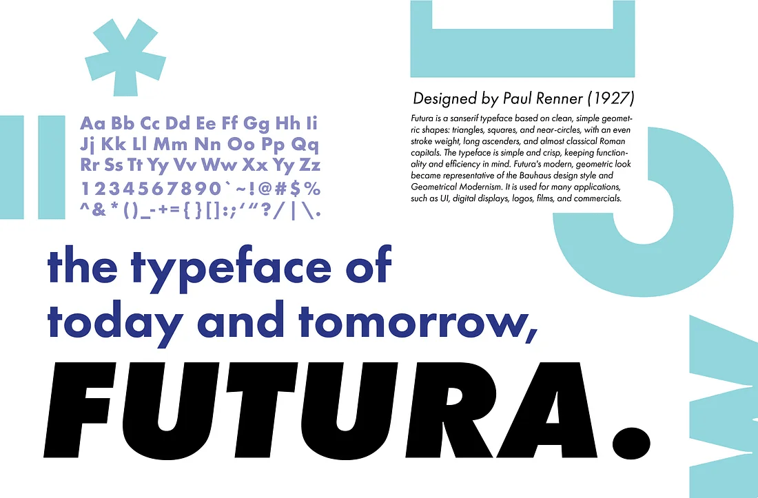
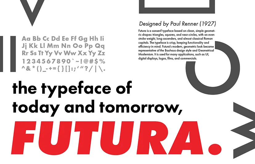
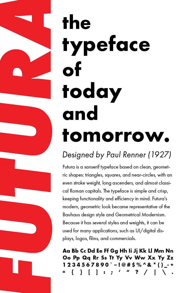
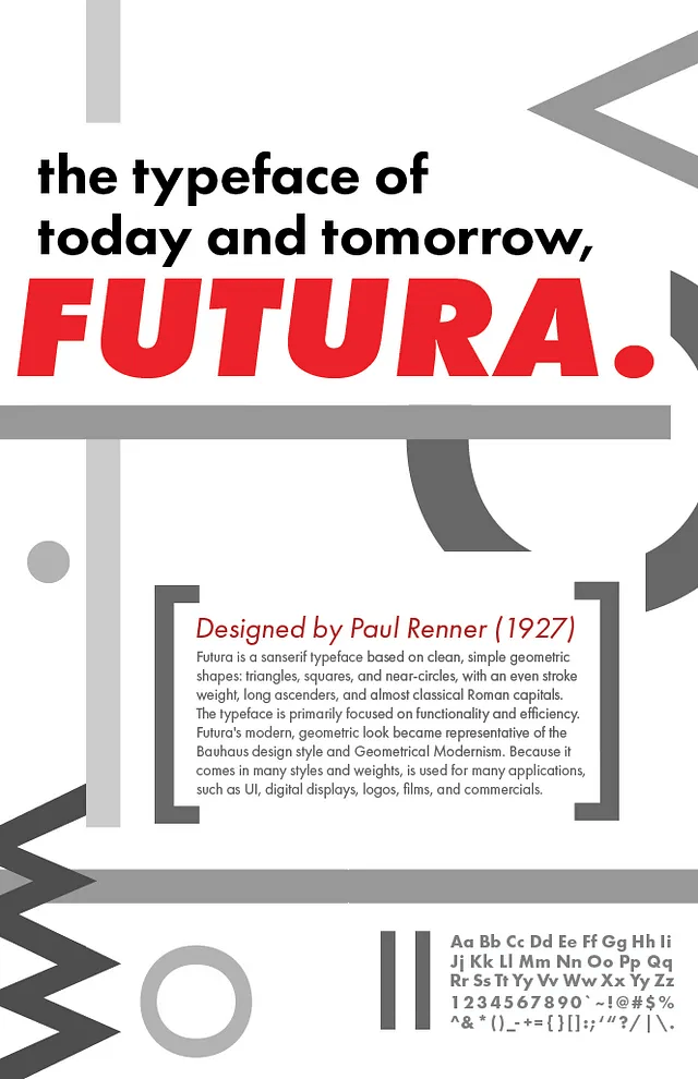
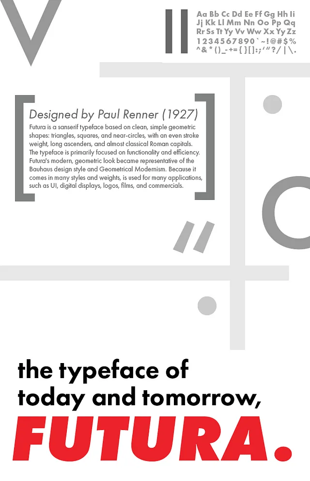
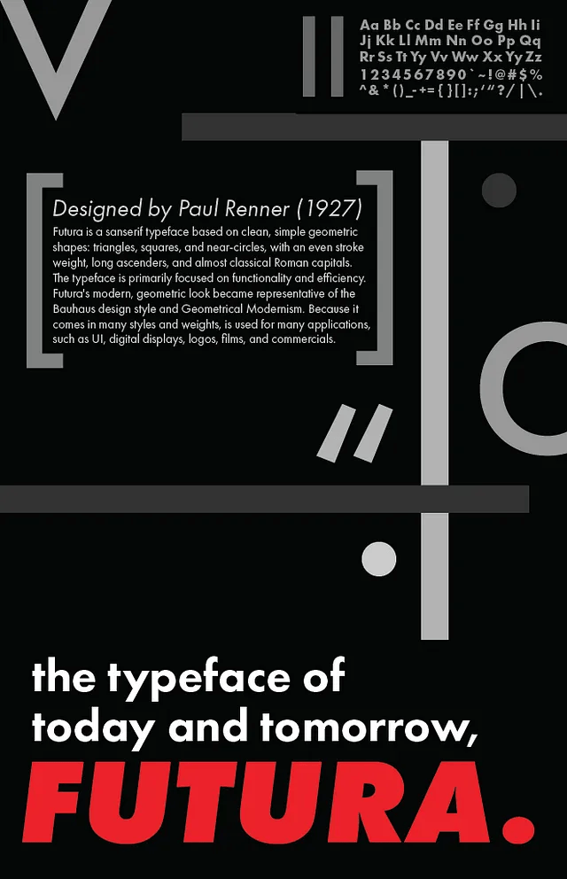
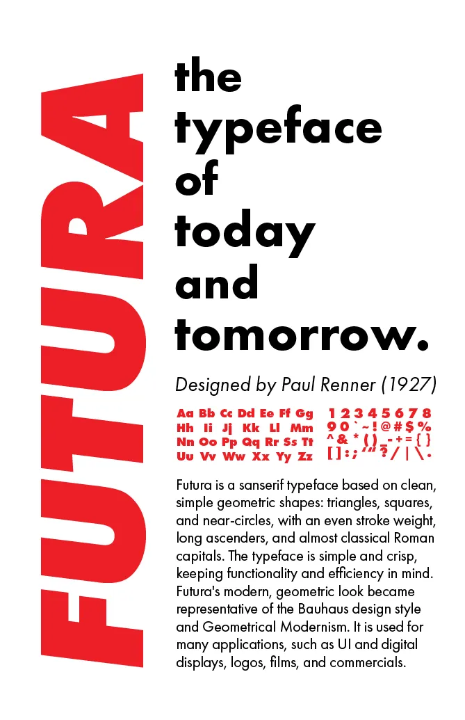
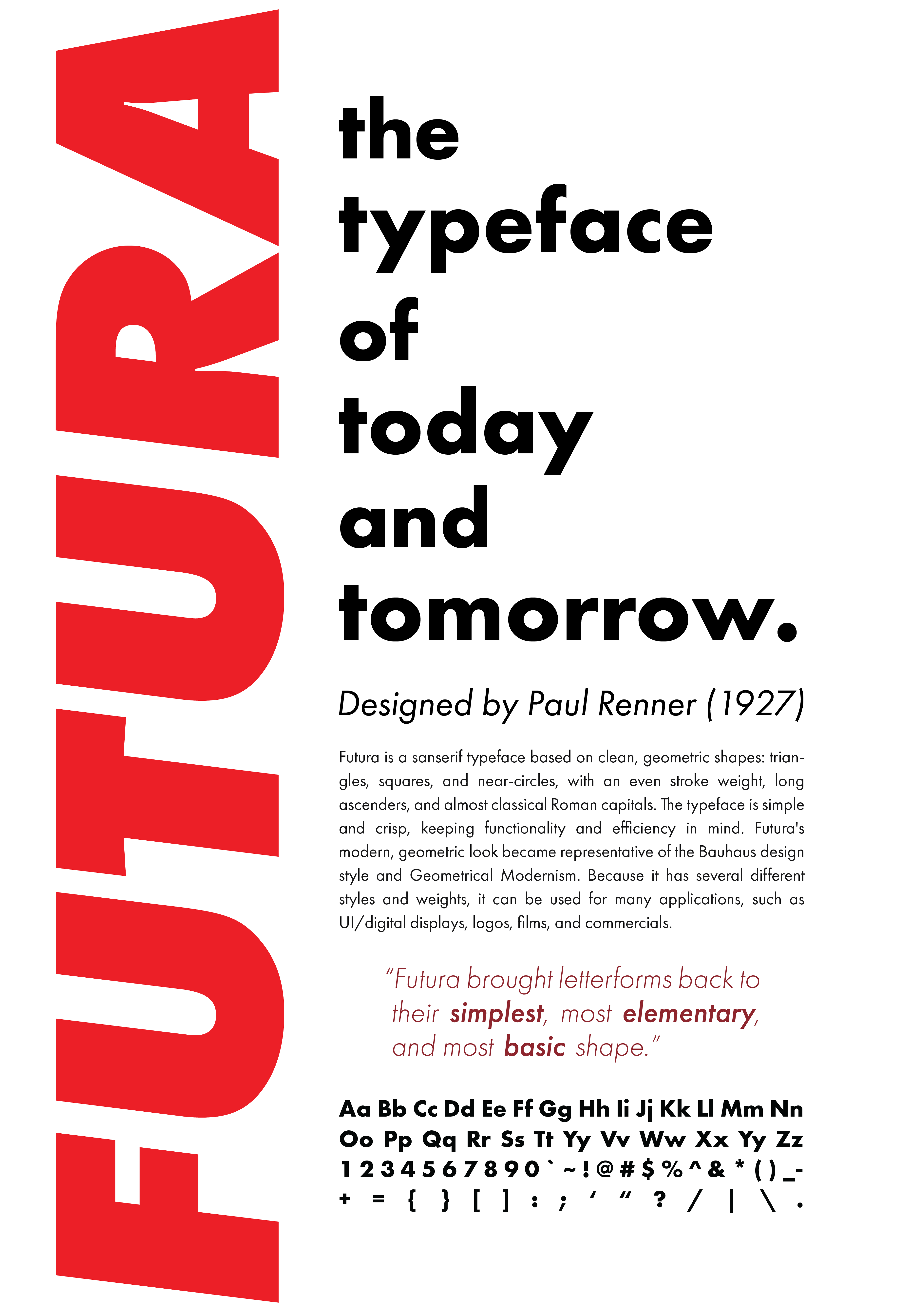
Final Result
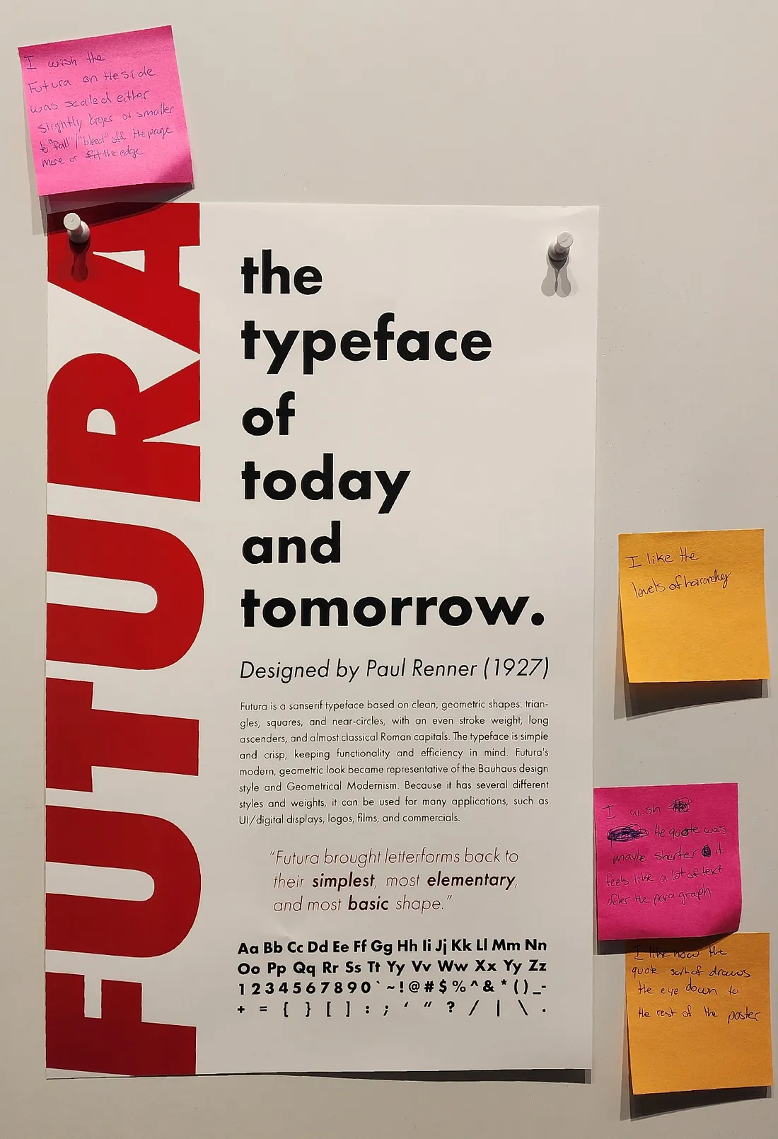
Overall, I‘m pretty pleased with my final design! Although my final design is very simple, it took several iterations to get to this point, with a lot of focus on trying to make the body paragraph most legible, and adding enough visual interest to draw a viewer in without compromising the minimalist look. I think I succeeded in portraying a clean and simple look, using a justified body text and character set to make rectangle shapes, aligning all elements to each other, and using minimal color.
This project definitely taught me a lot about the nitty-gritty of using text in designs — although I had a pretty basic design concept, I still had to play a lot with the leading, kerning, size, and alignment of the text to achieve the best legibility and overall balance of the poster. I think the most helpful change I made was decreasing the size of the paragraph and adding the quote — it was very impactful on the overall flow of the poster, and kept that area from getting too heavy with paragraph text.
Overall, I thought this project was very useful. I feel that I have gained much more experience and insight into informational poster design, using text tools in Adobe Illustrator, and manipulating text to achieve different effects, while learning more about the ubiquitous font, Futura and creating a final product I’m proud of.